I read a lot of web articles on my e-reader (often using Push to Kindle which is fantastic). I left the Kindle ecosystem a while ago and Pocketbook (a TouchHD 3) has been a good home so far.
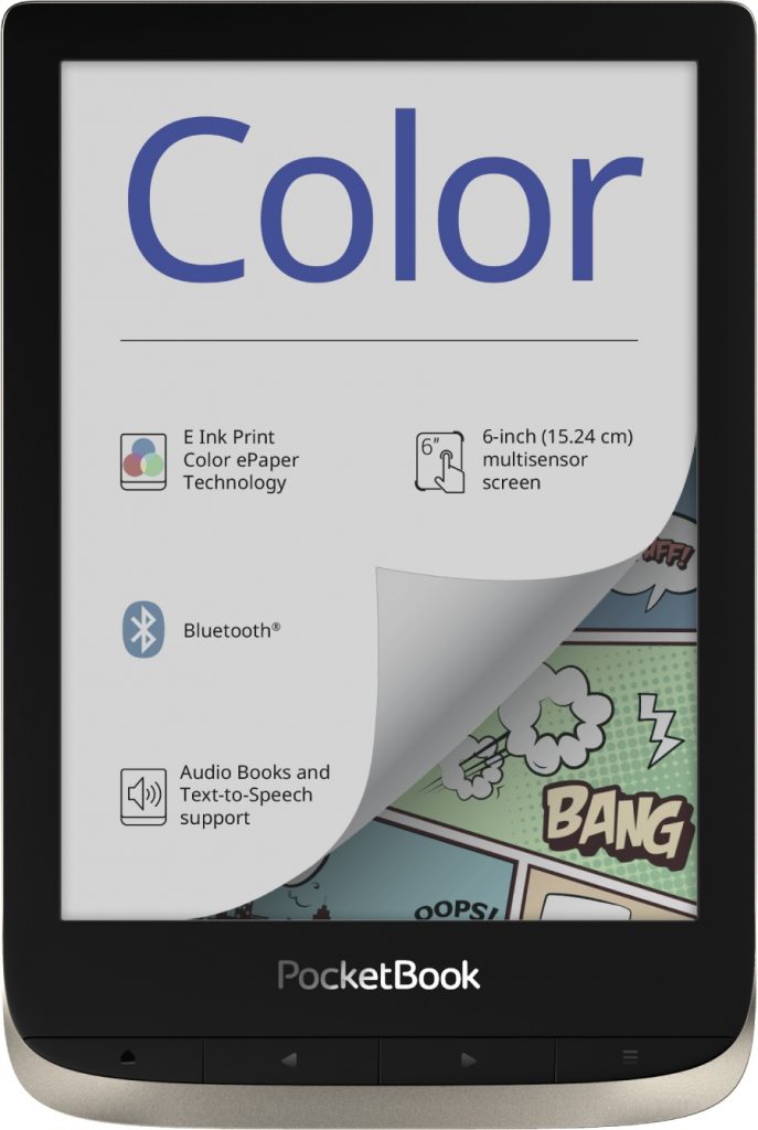
Since my content is often a mix of text and non-text, I was appealed by a color eInk screen. The Pocketbook Color recently came out and I purchased one to test it.

Here are my conclusions after about two weeks of usage:
Pro
- While limited in their range, colors work well for diagrams, illustrations and screenshots. Photos can look a bit awkward but it’s definitely better than greyscale.
- Before this e-reader, I haven’t read comics on a device but with color it’s quite fun. The clipping tools in the UI are useful to get rid of white borders around the actual comics.
Con
- It’s not very suitable for night time reading (which is my main use case), the minimum brightness is high, there is only white backlight.
- With the strong white backlight it feels like an LCD screen which kind of diminishes the idea behind eInk.
- The technology seems to use two layers: one “common” 300dpi greyscale, and one around 150dpi color layer. This results in a pattern overlaying the whole screen making the screen less crips when reading text.
- Pocketbook readers are rather slow. I always wonder how they do scrolling and inertia so much better than Kindles but feel so. slow. navigating through the UI.
Overall, I think color eInk is technology well worth exploring, especially when no backlight is necessary and it doesn’t need any battery power (think photo walls)
I am torn whether I’ll keep the Pocketbook Color as my main reading device because using the reader in the dark is like turning on the light in the room.